Background
Branding & Design- Branch
My Role
Branch combines live facilitation with a digital experience that supports participants before, during, and after workshops. The platform helps teams capture ideas, track progress, and prepare for meaningful discussions, while facilitators guide the group through a proven innovation framework. This project required creating a visual system that balanced professionalism with creativity, supporting both the human-led workshop experience and the digital tools that make collaboration more effective.
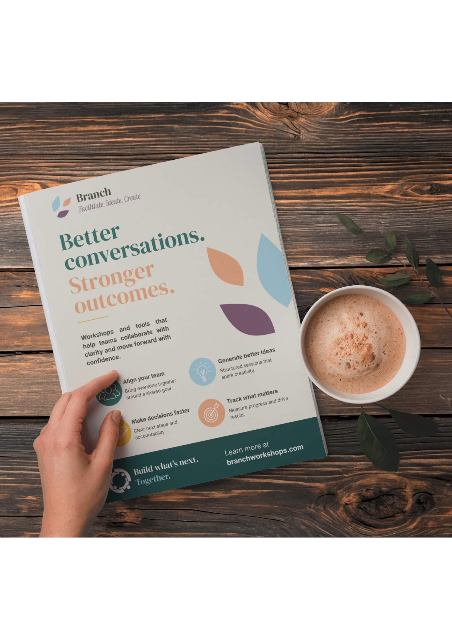
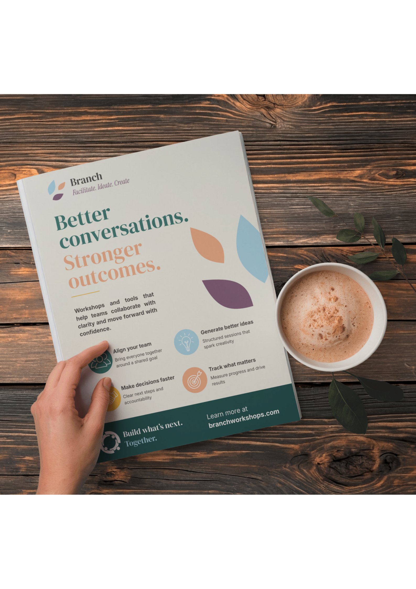
This flyer was designed to promote Branch's facilitated workshop experience in a clear, engaging, and approachable format.
The layout uses bold typography and strong visual hierarchy to quickly communicate Branch's value proposition, while the brand's organic shapes and soft color palette reinforce themes of collaboration, creativity, and growth.
Key workshop outcomes are highlighted through a simple icon system, allowing viewers to quickly understand the benefits of the program. The result is a promotional piece that balances professionalism with personality, encouraging teams to explore a more structured and effective approach to problem-solving.
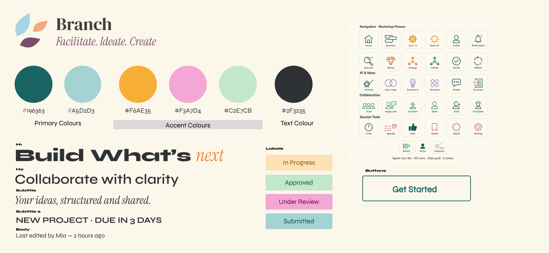
The Branch visual identity was designed to balance creativity with clarity. Inspired by collaboration, learning, and productivity platforms, I selected a palette of soft greens, yellows, pinks, and blues to create an approachable, optimistic feel while maintaining professionalism. A clean sans-serif typeface provides clarity and legibility throughout the experience, while a complementary serif adds warmth and personality to key moments. Together, these elements create a visual system that feels inviting, collaborative, and structured.
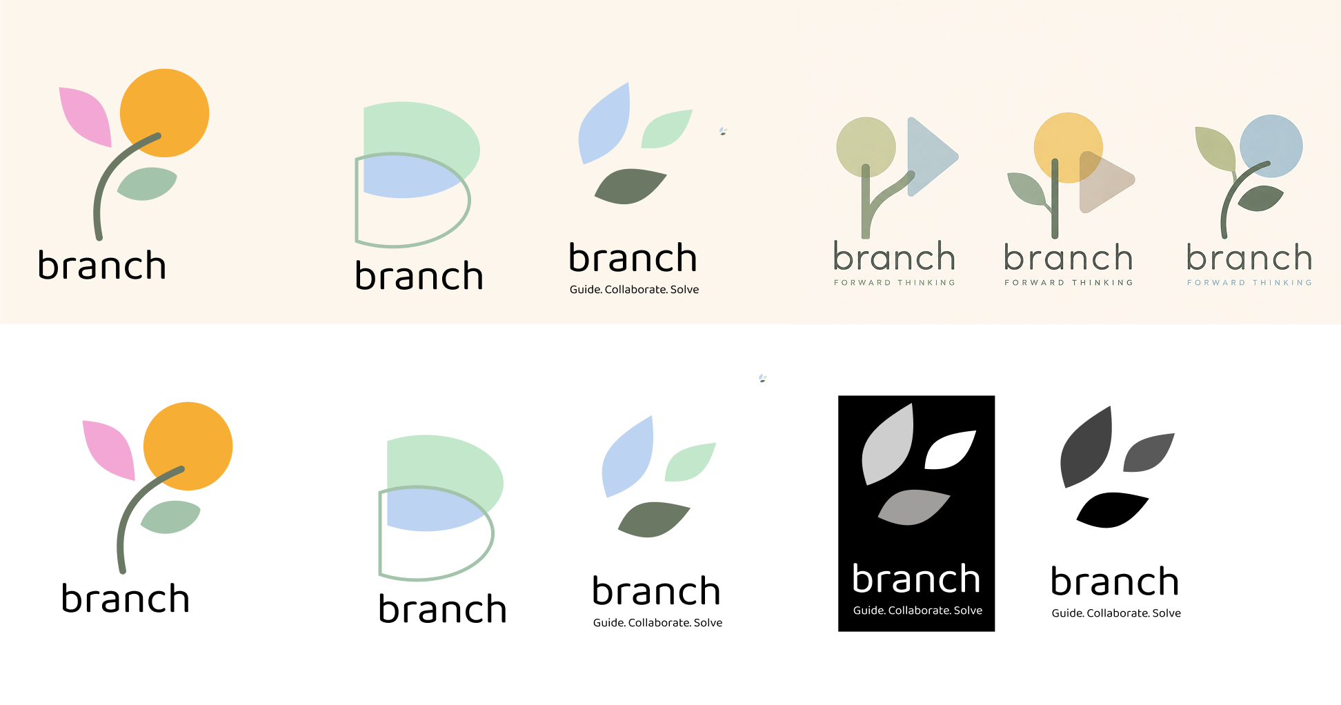
The Branch logo was inspired by the idea that meaningful growth begins with a single idea. Throughout the exploration process, I developed concepts centered around leaves, branches, and organic forms to symbolize growth, renewal, and new possibilities. Just as a branch extends outward and creates new paths, creative problem-solving opens opportunities for teams to move beyond existing challenges and discover better solutions.
The final direction combines natural forms with simple geometric shapes to create a mark that feels optimistic, collaborative, and forward-looking. Soft curves and upward movement reinforce themes of progress and transformation, while the adaptable icon system allows the brand to scale seamlessly across digital products, workshop materials, and marketing assets. The result is a visual identity that reflects Branch's core purpose: helping people grow ideas into meaningful action.
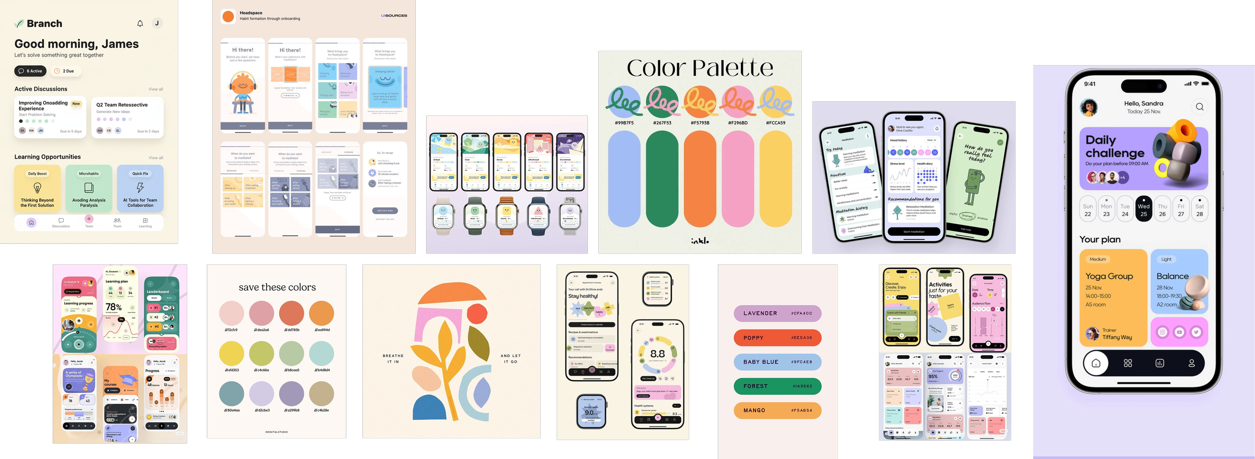
To define Branch's visual identity, I began by researching products and brands operating at the intersection of collaboration, learning, productivity, and habit formation. I analyzed workshop tools, educational platforms, wellness apps, and modern SaaS products to understand how visual design can encourage engagement, creativity, and sustained participation.
A clear trend emerged: successful products balanced structure with approachability. Rather than relying on traditional corporate blues and greys, many used soft, optimistic color palettes, rounded interfaces, and playful visual elements to reduce friction and make complex processes feel more accessible.
Drawing from these insights, I developed a palette of warm, muted colors that felt creative and inviting without sacrificing professionalism. The selected typography combines clarity and readability with subtle personality, while rounded UI components and organic brand elements reinforce the collaborative, human-centered nature of the Branch experience. The result is a visual system that supports the facilitated workshop process—helping participants feel comfortable contributing ideas, staying engaged, and working together toward meaningful outcomes.
Design
Research
From early research through final execution, I was responsible for shaping Branch's visual identity. I explored themes of creativity, collaboration, and structured problem-solving to develop mood boards, color palettes, typography systems, logo concepts, UI elements, and marketing assets. The goal was to create a brand that felt innovative and inspiring while remaining clear, professional, and easy to navigate.
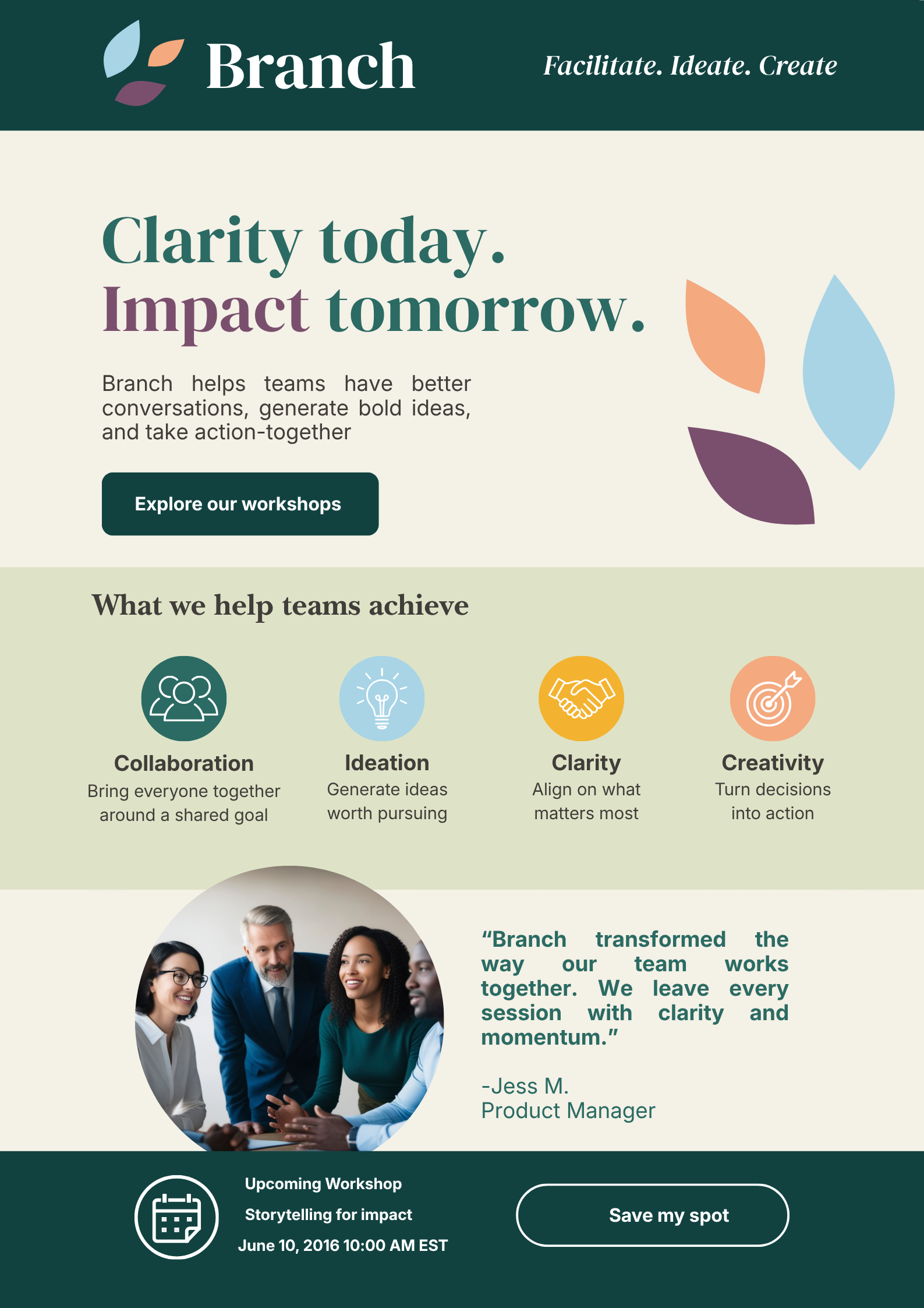
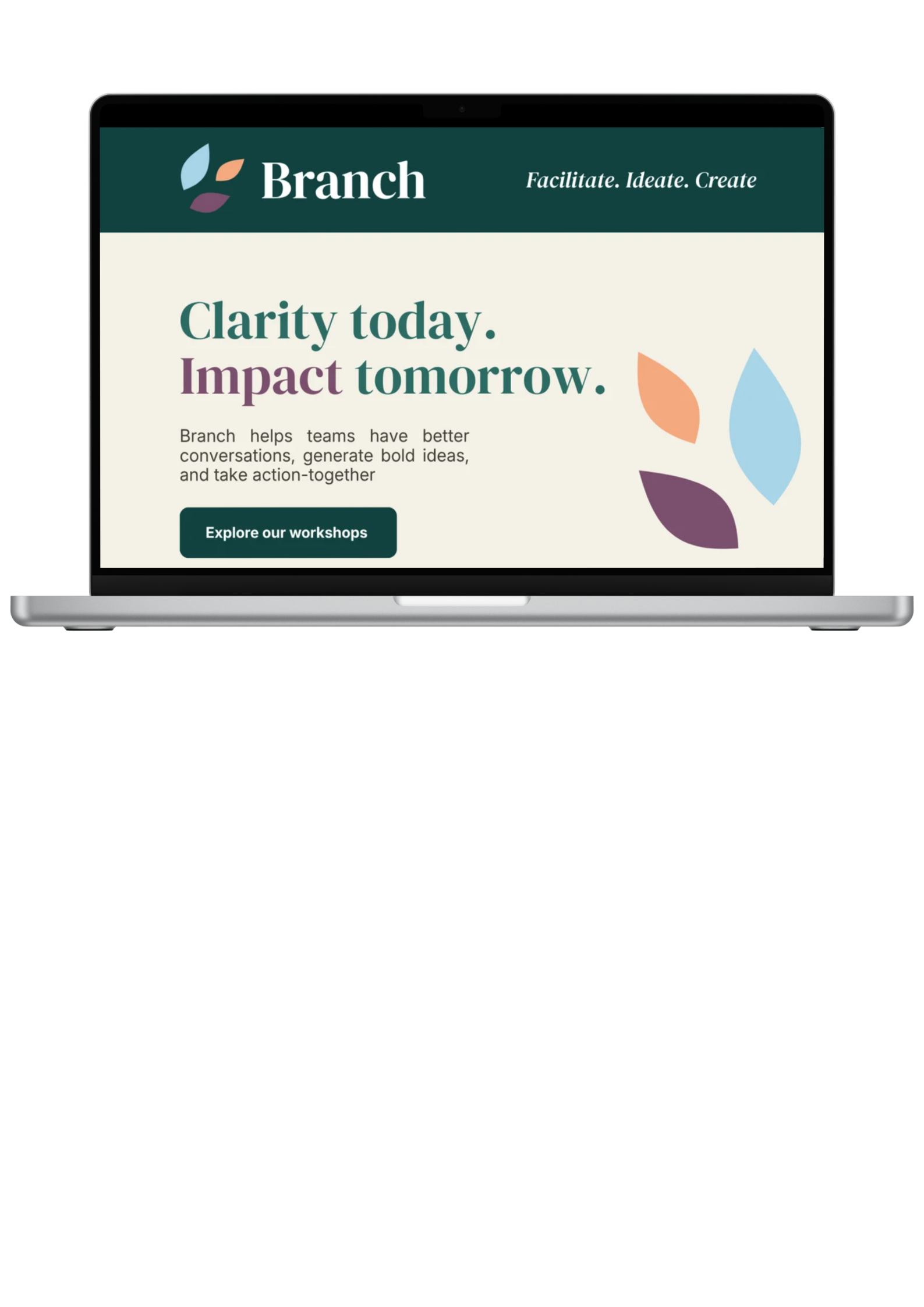
To demonstrate how the Branch brand could extend beyond the core workshop experience, I designed an email marketing template focused on engagement and event promotion. The layout combines clear information hierarchy, strong calls-to-action, and brand-consistent visual elements to guide readers from awareness to registration.
Soft, approachable colors and organic shapes reinforce the themes of collaboration and creativity, while testimonials and workshop highlights build credibility and encourage participation. The result is a scalable communication tool that keeps teams connected, informed, and engaged between facilitated sessions.