Background
Branding & Design- Pint Sized Picnic
My Role
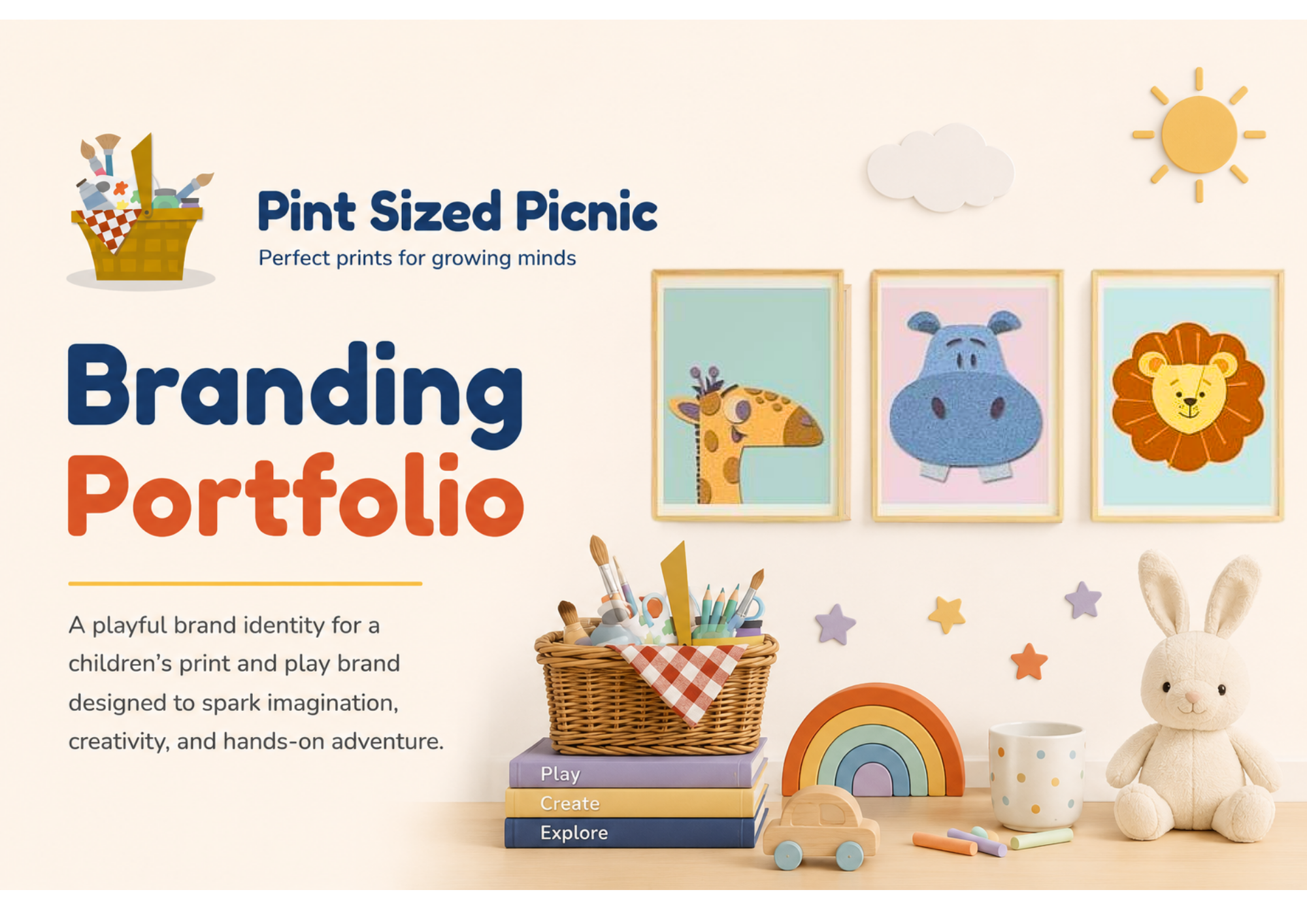
Pint Sized Picnic needed a brand identity that balanced creativity, learning, and play while appealing to both children and parents. The goal was to create a vibrant, engaging brand that celebrates the power of imagination and encourages screen-free exploration through art and open-ended play.
The resulting identity draws inspiration from childhood adventure, creative discovery, and hands-on learning. Through a playful colour palette, friendly typography, and an imaginative visual system, the brand communicates its mission to help children learn, explore, and grow through meaningful play experiences.
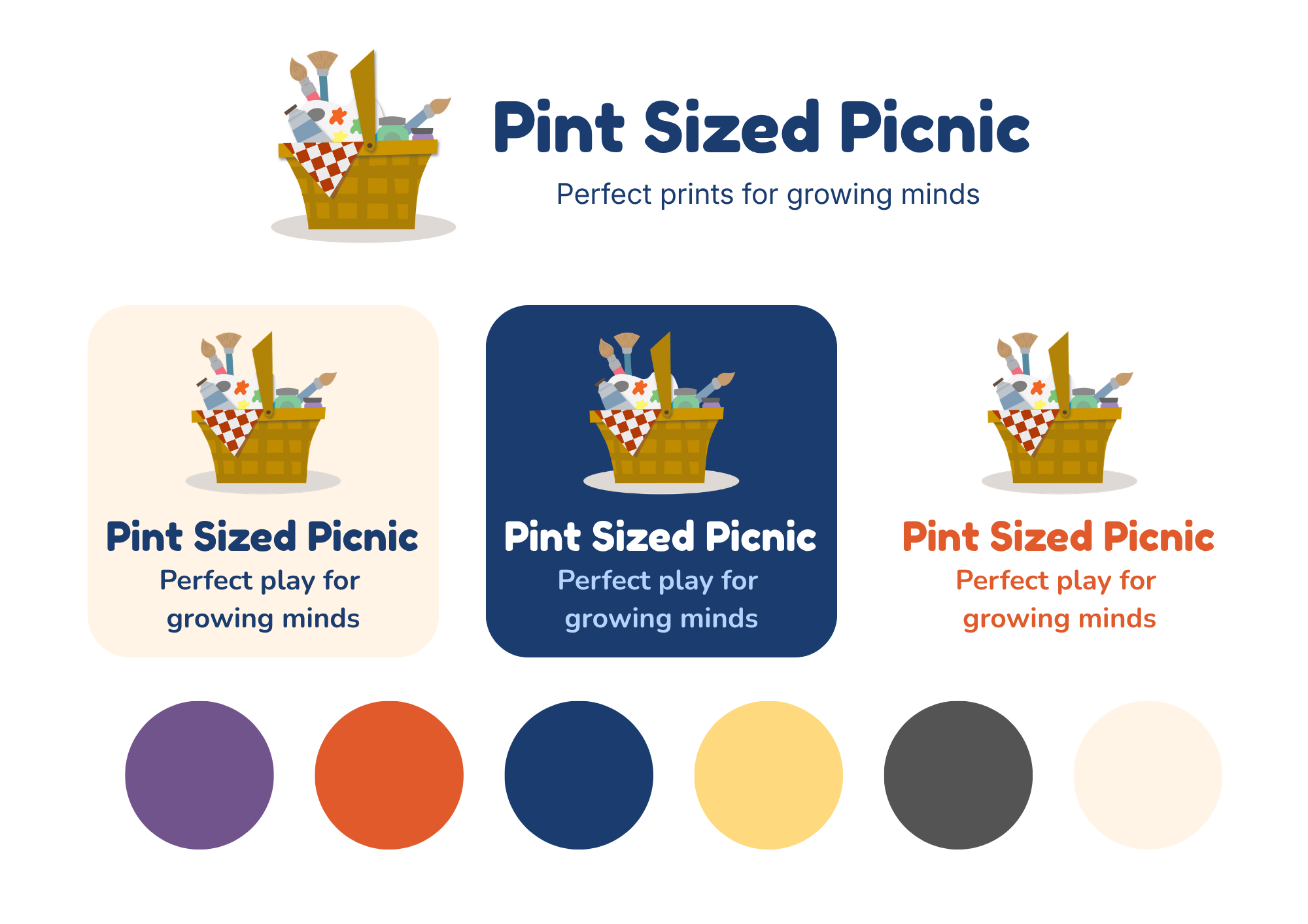
The Pint Sized Picnic logo combines a picnic basket with art supplies to represent creativity, exploration, and hands-on learning. The basket acts as a container for imagination and discovery, reflecting the brand's mission to inspire children through open-ended play.
A vibrant palette of orange, yellow, and navy blue brings energy, optimism, and trust to the brand, while softer neutral tones create balance and warmth. Together, the logo and colours create a playful, welcoming identity that appeals to both children and parents.
The visual identity was designed as a flexible system that translates seamlessly across digital and print touchpoints.
Bold colour blocking, rounded shapes, and playful typography create a sense of energy and accessibility, while maintaining clarity and consistency. The resulting marketing materials feel engaging, optimistic, and child-friendly, helping the brand stand out while reinforcing its mission of creative, hands-on learning through play.
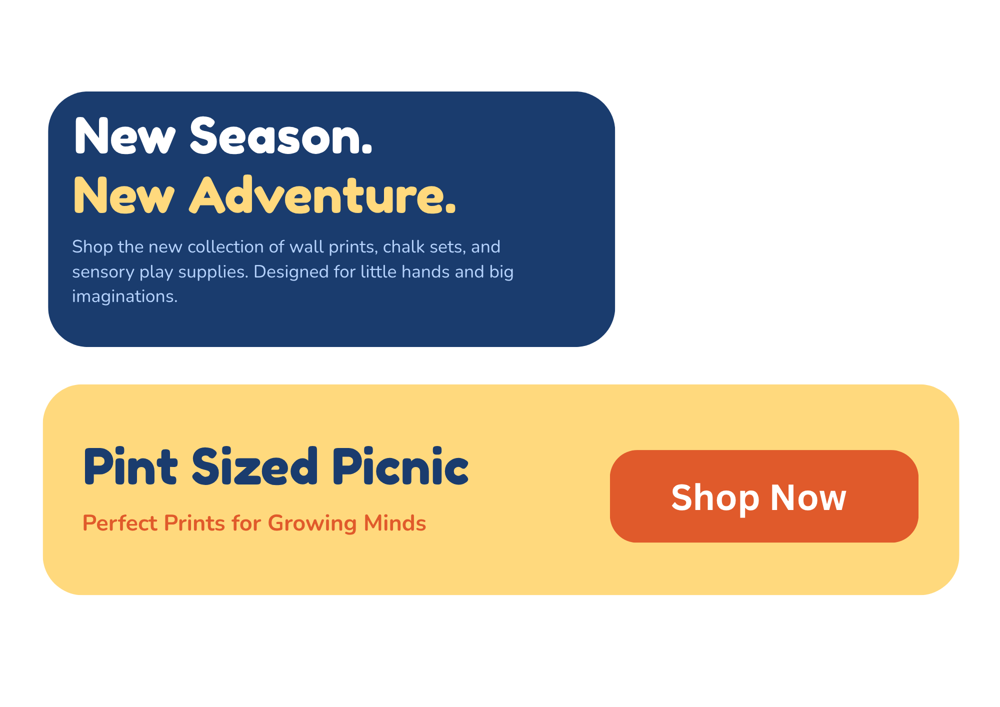
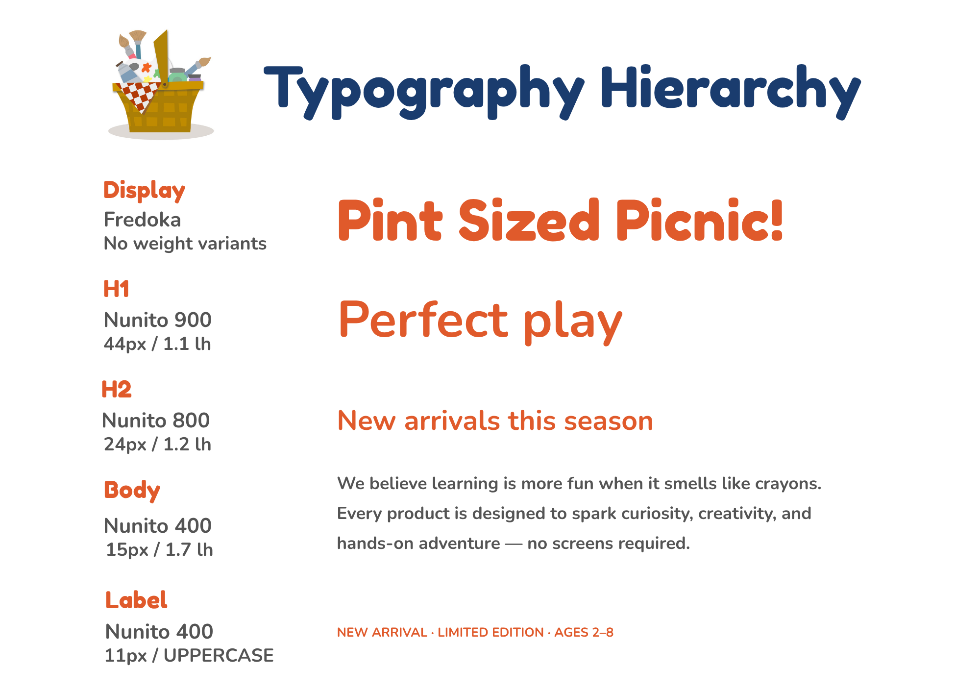
Typography plays a key role in bringing the brand's playful personality to life. A bold, rounded display typeface creates a sense of fun, creativity, and approachability, while the supporting type system provides clear hierarchy and readability across marketing materials and digital touchpoints.
The combination balances childlike energy with structure, ensuring the brand feels engaging and imaginative without sacrificing clarity. This flexible typography system helps communicate information effectively while reinforcing the joyful, hands-on spirit of Pint Sized Picnic.
Brand Strategy • Visual Identity Design • Illustration & Artwork Creation
I led the development of the Pint Sized Picnic brand from the ground up, defining its strategy, positioning, and visual identity.
I designed the logo, colour palette, typography system, and brand assets, while also creating the original artwork that brings the brand's playful, creative, and educational mission to life.
Design
Print & Advertising