
Background
Spotify Kids - Add a feature
My Role
This project reimagines Spotify for younger listeners, creating a safer music discovery experience without sacrificing independence or engagement. The redesign focuses on age-appropriate content, simplified navigation, and improved parental controls, helping children explore music confidently while giving parents greater peace of mind. Through research and UX design, I developed solutions that balance safety, autonomy, and the core Spotify experience.
Research
I led the project end-to-end, conducting user research, defining the problem space, developing the UX strategy, and designing the final solution. While the redesign introduces new features and interaction patterns tailored to younger users, it was built within Spotify's existing design system and visual language to ensure consistency with the broader product ecosystem. All research, concept development, wireframing, prototyping, and UI design were completed independently.
To understand the challenges families face with music streaming, I conducted secondary research on children's digital media habits, parental concerns around online content, and best practices for designing safe experiences for younger users. I also reviewed Spotify's existing product offerings, including Spotify Kids, and analyzed competing platforms to identify gaps and opportunities. These insights informed key design decisions around content safety, discovery, parental controls, and user independence, helping ensure the solution balanced both children's and parents' needs.
Define
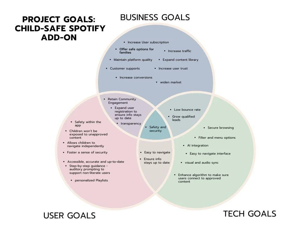
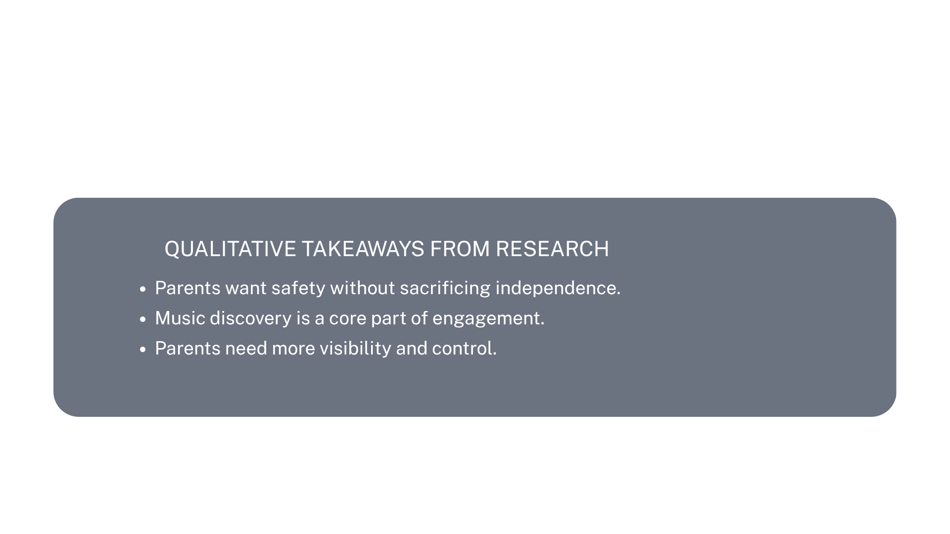
After synthesizing the research findings, I identified the core challenge: how might Spotify enable children to discover and enjoy music independently while giving parents confidence that the experience remains safe and age-appropriate? This phase focused on translating user needs into clear design requirements, prioritizing features that balanced music discovery, content safety, and parental oversight.
Design
Wireframes
Stepping into the design framework, I created a series of low-fidelity wire frames.
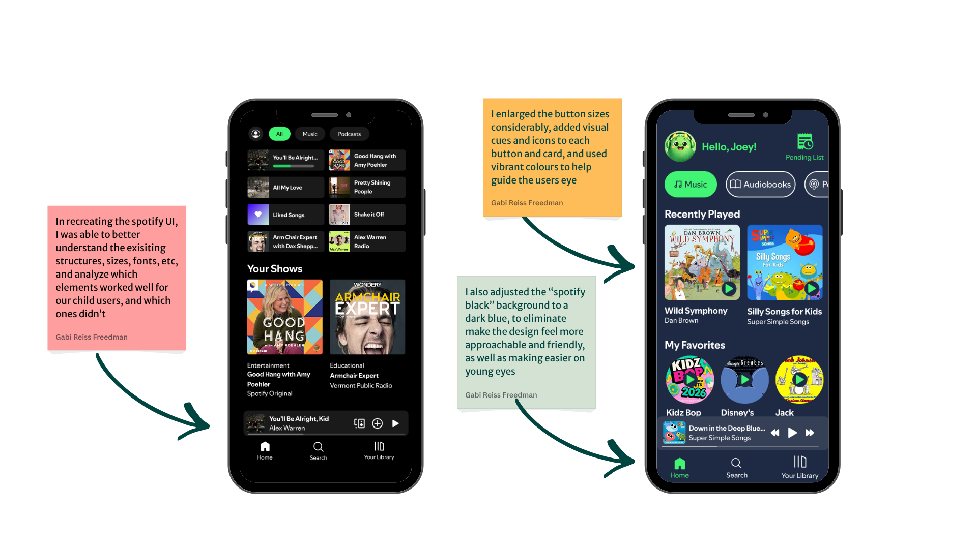
I based my designs on my research of the original Spotify App, as well as extensive reseach into children’s apps. My goal was to ensure the app felt like a natural extension of the existing Spotify App, while also meeting the needs of children.
Three main components that I prioritized to ensure accessibility for children was:
Large, easily accessible buttons- ensuring accessiblity for children with weaker fine motor skills
Safety functions that would allow parents peace of mind, knowing their child cannot access other user profiles
Strong use of icons and visual cues to help pre-literate users
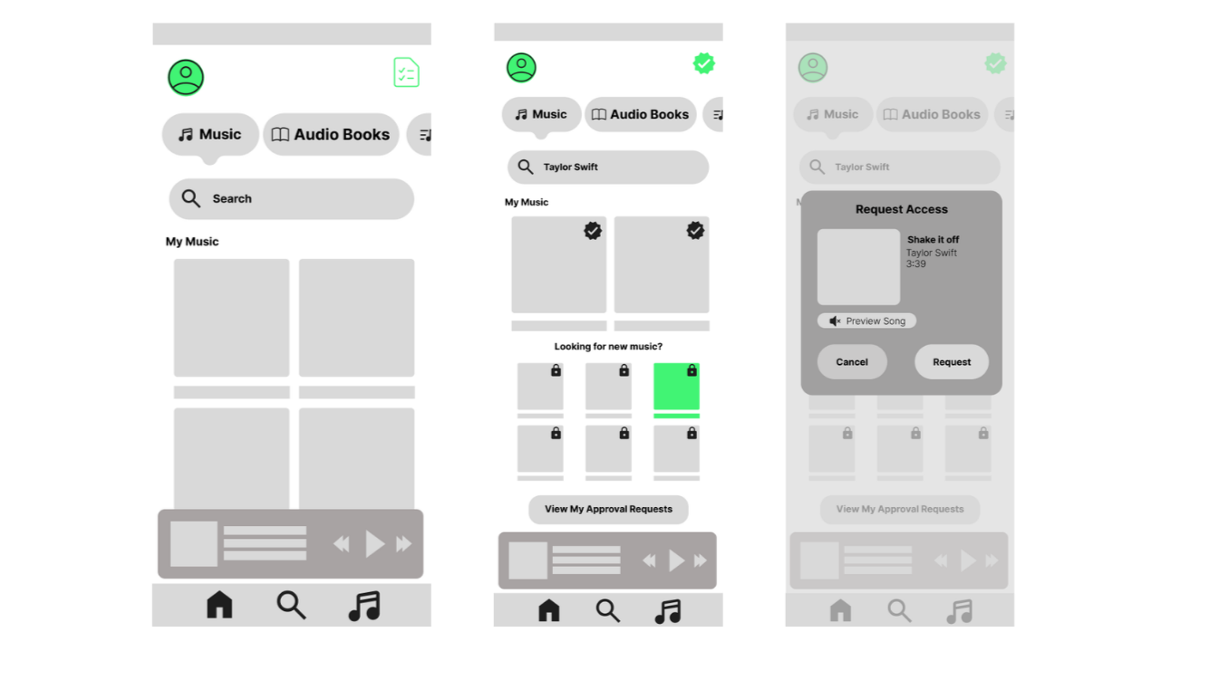
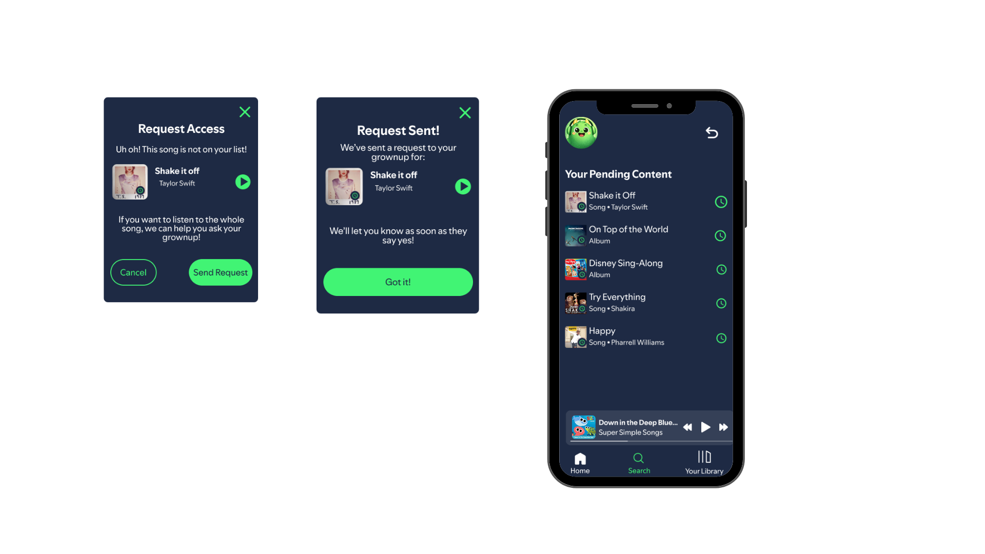
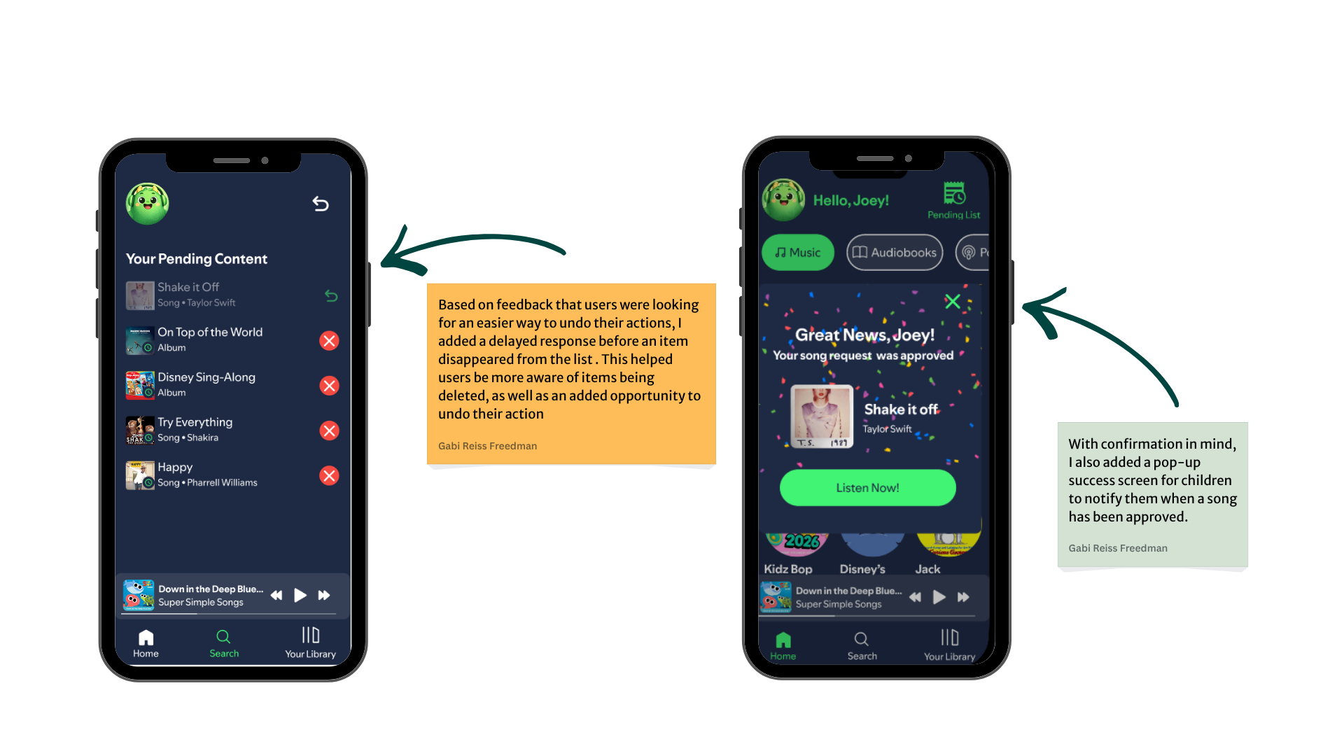
In order to prioritize safety, I also introduced a feature where new content undergoes a parent approval process before children can access songs and/or podcasts. Kids would easily be able to manage their own content requests, which would be sent to the parent’s profile as a push notification
Visual Design
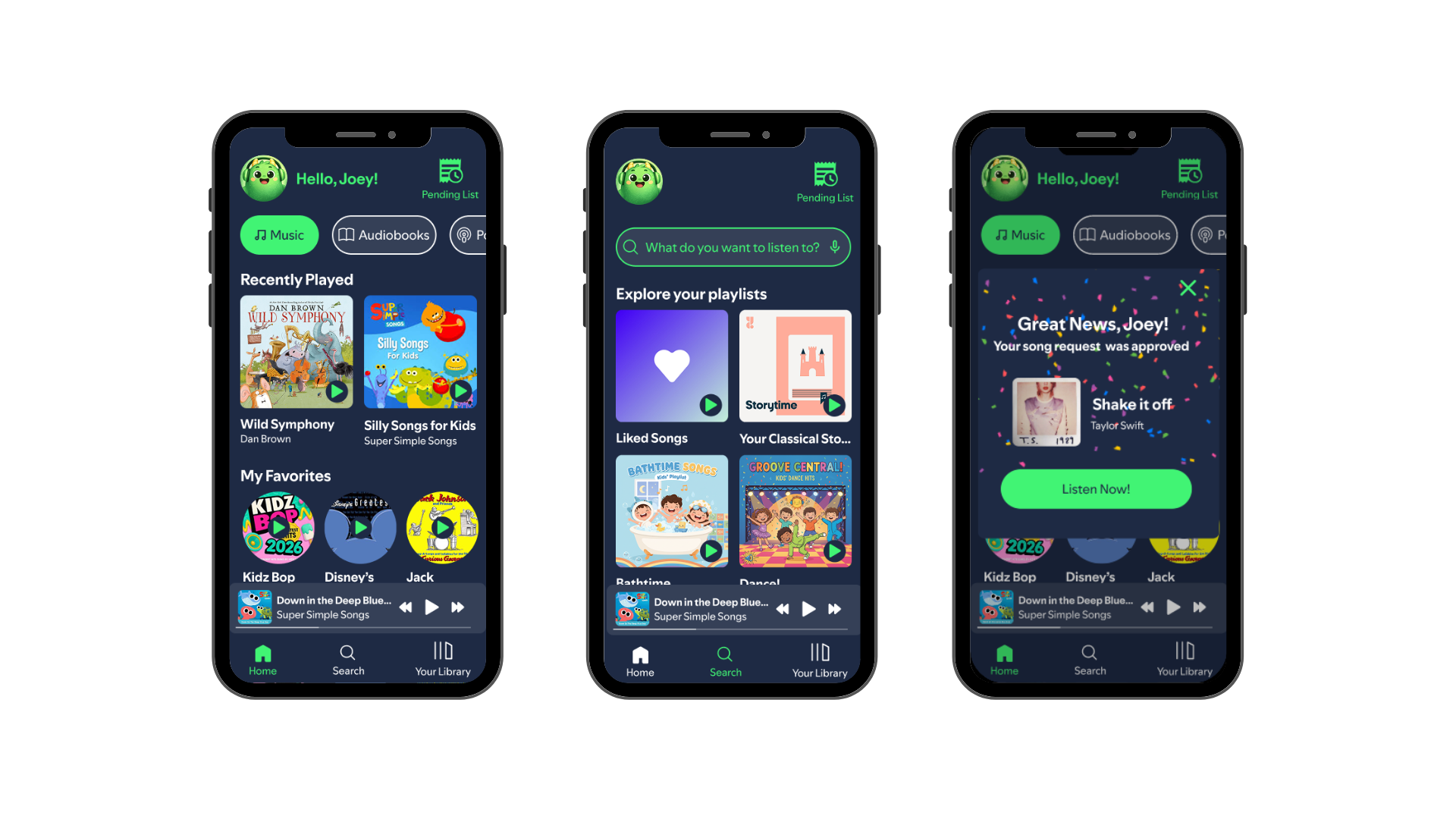
The biggest design challenge I faced within this redesign, was determing how to keep the product feeling true to the original app design, while also meeting the needs of young users. While the Spotify app is beautifully built with modern adults in mind- it was missing the key elements I was looking for to support my child users - Safety, accessibility and support. Not only did I want to encorporate those features into my product, I wanted them to be immediately clear to both parents and children as soon as they opened the app for the first time.
I tested everything from button designs, colours, images and component placement with a wide range of children- from as young as three, all the way up to 13 years old- and prioritized testing users of different abilities, neurotypes, and literacy skills, to ensure the app was accessible and understandable for all.
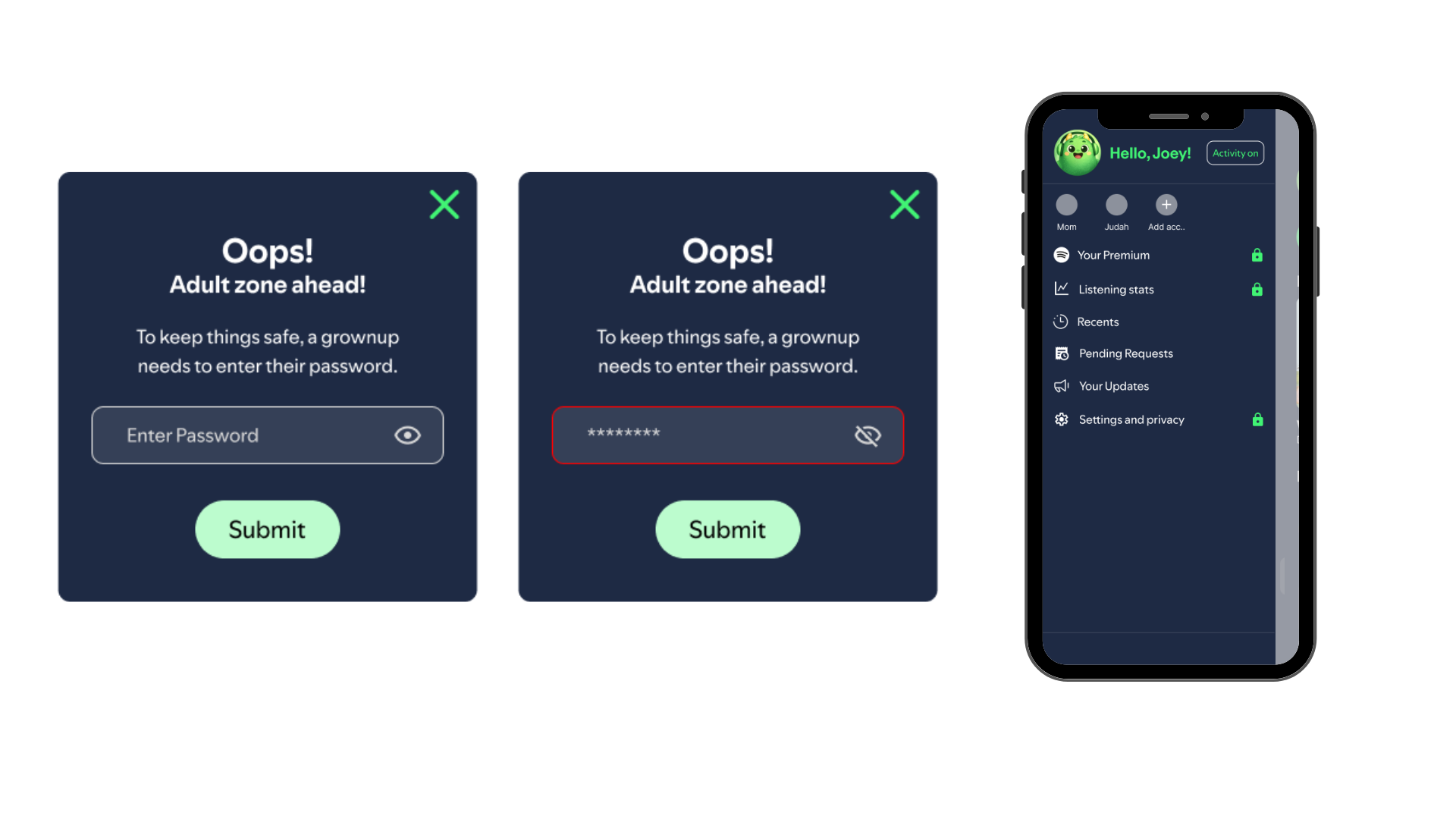
Another safety feature I added was password protection when users want to move from an adult profile into a child profile, to avoid child users from accessing unfiltered content or approving their own requests
Iterations
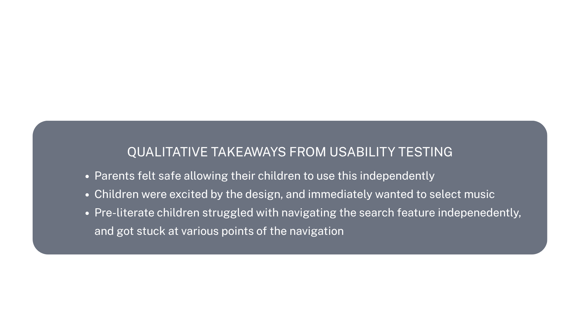
Based on the feedback from user testing, I added in a key feature- voice over navigation support. I then retested the same designs, and had significantly improved results from child users, who were now able to successfully, and independently, navigate the site.
I also added a delay to deleted items, to help raise awareness for the user when a list item was removed, as well as an added opportunity for them to “undo” their action.
Taking Action
After bringing it all together, and analyzing the results of my user research, I believe this product could fill a need for many parents and children, and allow children to navigate the app independently.
The key features- large buttons, approachable and colourful designs, and the addition of the voice-over navigation support, my testing showed a product that felt both true to the spotify app, as well as an opportunity for independence for our child users.
Results
Contact us
Interested in working together? Fill out some info and we will be in touch shortly. We can’t wait to hear from you!