
Background
SettleWell Relocation Assistant
My Role
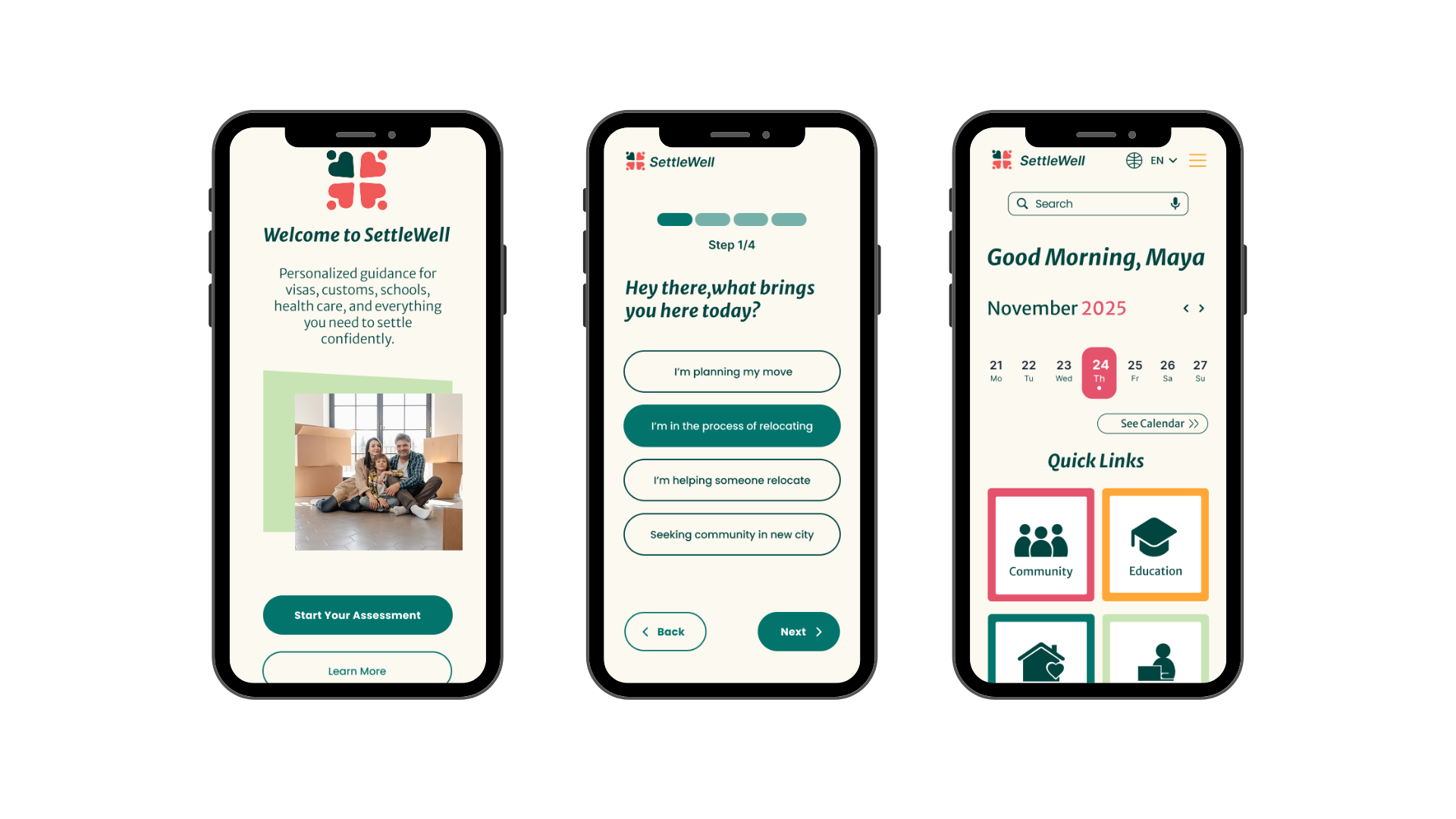
SettleWell is a mobile app designed to help users navigate the challenges of settling into a new place by transforming a complex, often stressful experience into a clearer, more supportive journey. Through user-centered research and thoughtful interaction design, I created an experience that prioritizes clarity, accessibility, and emotional reassurance—helping users stay organized, informed, and empowered during times of transition.
Research
As the UX designer for SettleWell, I guided the project from initial concept through final design. My responsibilities included user research, defining user needs and pain points, developing user flows and information architecture, creating wireframes and high-fidelity screens, and shaping the overall interaction and visual design. I also focused on accessibility and emotional usability, ensuring the product not only functioned well, but felt reassuring and easy to navigate during a stressful life transition.
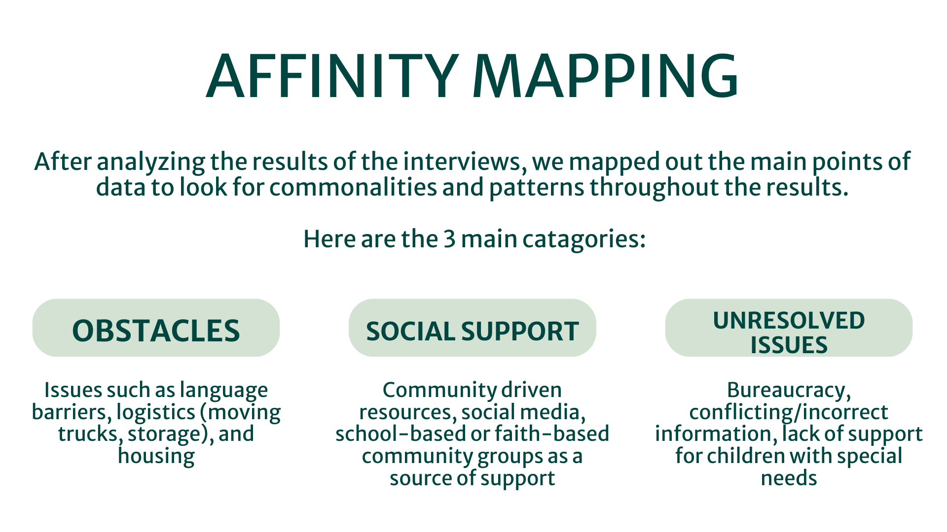
In order to help define the best steps to meet the needs of potential user, I created a map of the project goals - business, user and tech- and narrowed down then most important themes. These themes guided the decisions being made throughout the entire development process. I then conducted interviews and affinity mapping to better understand who we were designing for, and how to best meet their needs.
After determining who I was designing for, I shifted my focus to how I could effectively design for my target audience:
In determining the final two solutions, I looked at my top ideas- things that came up over and over and/or stood out the most to me- and tried to find the ones that checked the most boxes in terms of what potential users (interviewees) were looking for, as well as what other competitors are offering, to find the ideas that had the strongest backing and would solve the most user problems.
I also looked for ideas that offered the most flexibility in terms of being able to grow the ideas and adapt them to evolving user needs
Define
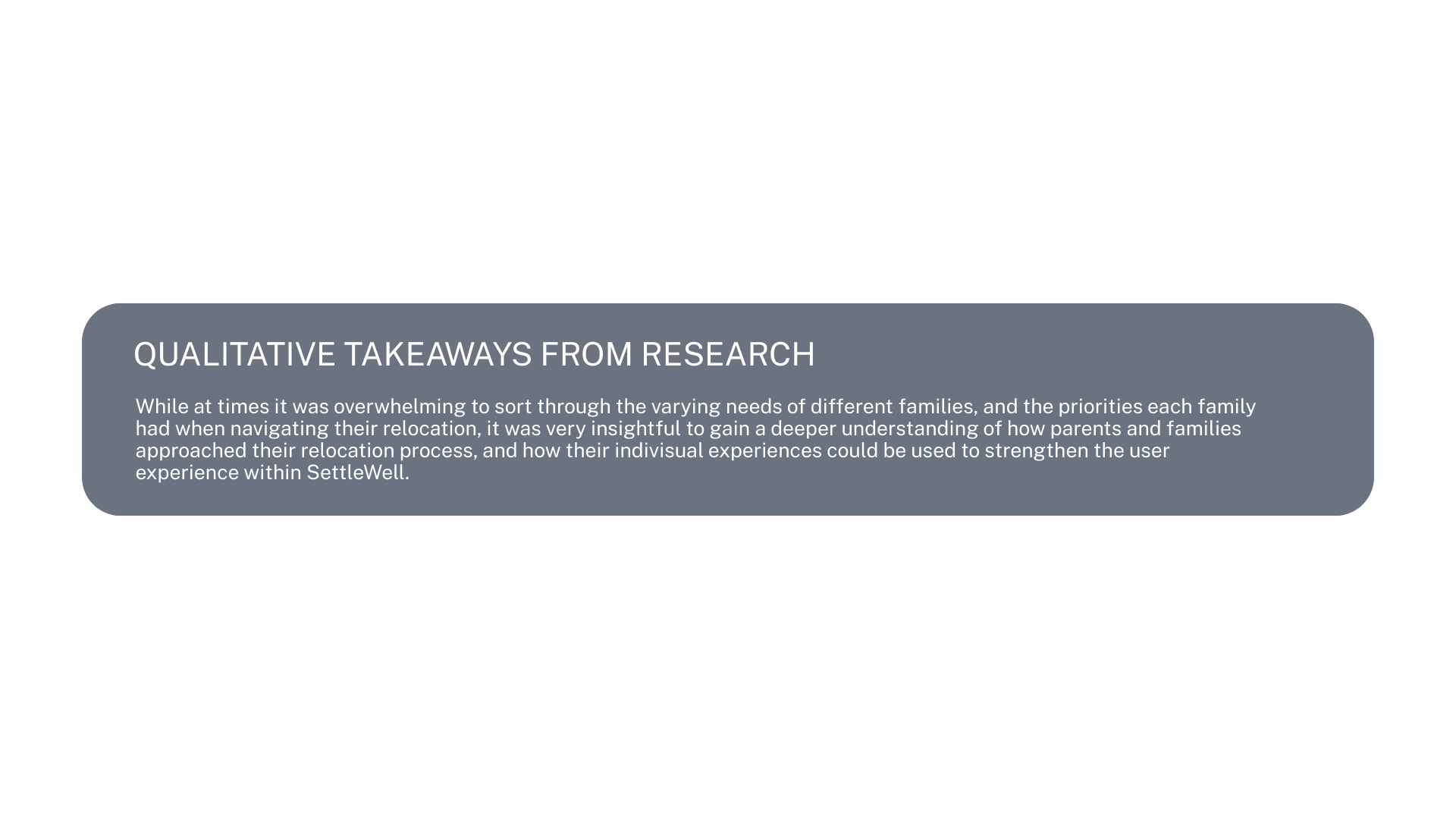
I reviewed the data, analyzed it from a UX perspective, and turned it into deliverables that put users first. To ensure our user needs stayed at the forefront of our design choices, we targeted one user type: parents relocating to a new country with their families . I created a persona—Sarah—based on my research.
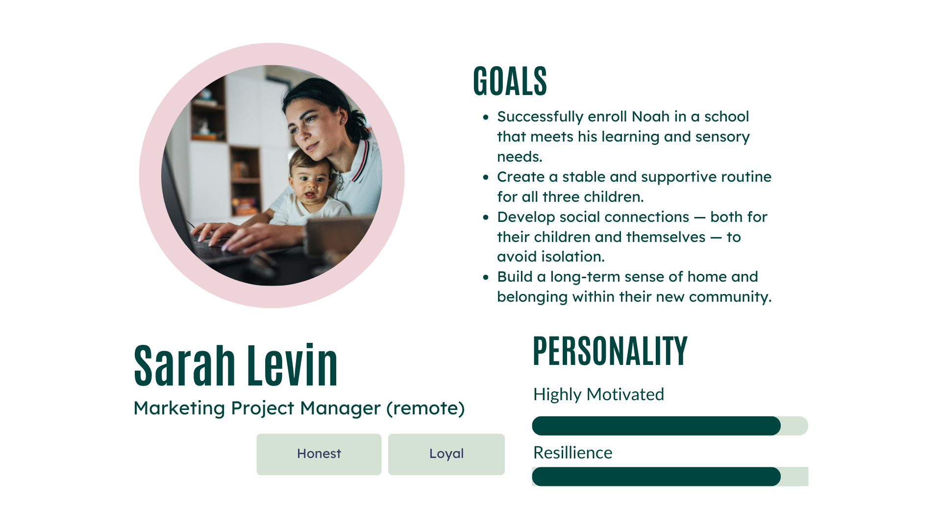
This persona reminded the team who might use SettleWell and helped design with a real user in mind.
Ideate
Sitemap
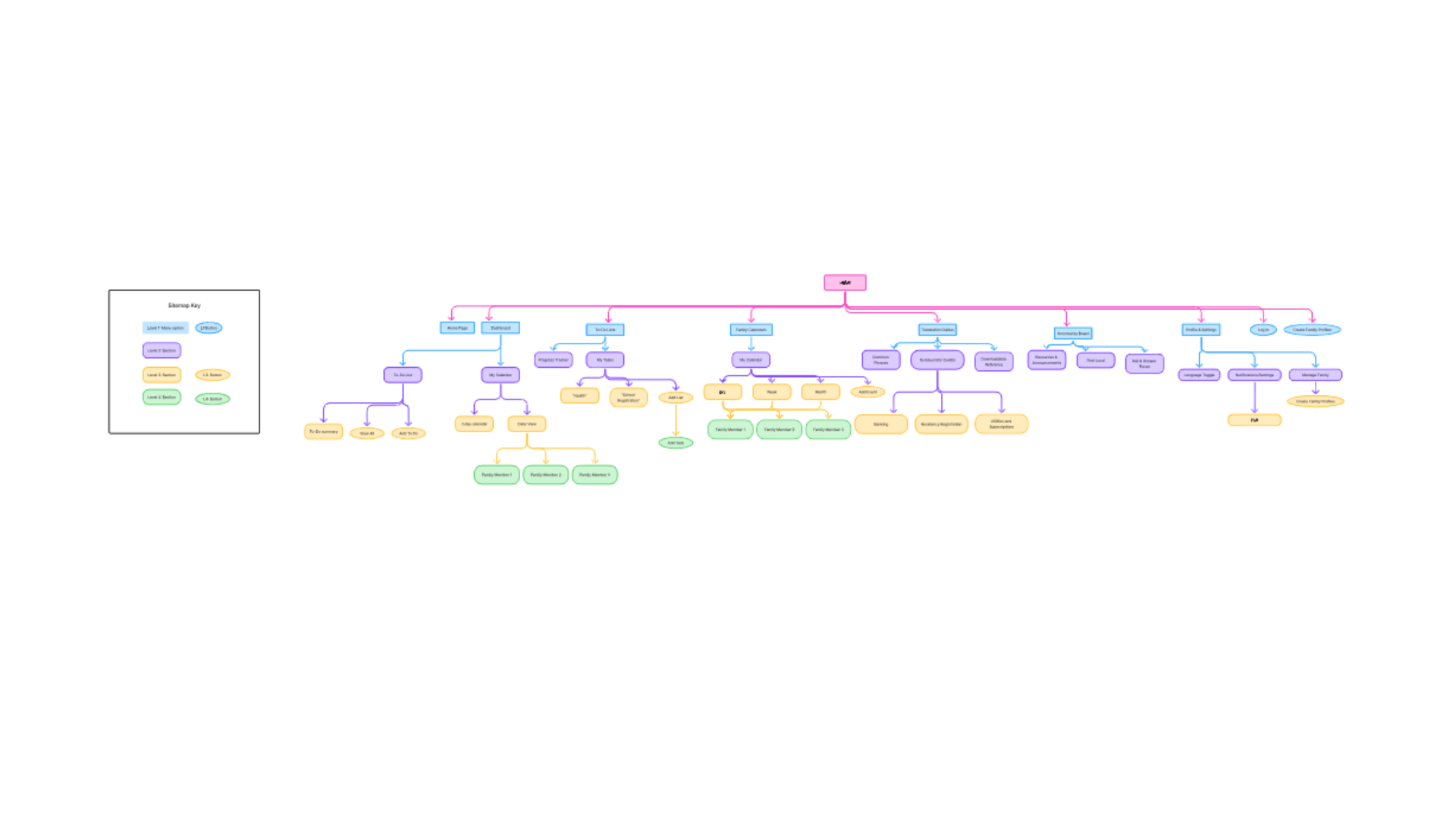
Stepping into the design process, I began with a site map- a map showing the different pages within the website and how they will be organized. This map helps not only with determining what needs to be included and where, but also helping to test the accessibility and usability of the site through user feedback.
The site map was built on the results of the card sorting exercise, which helped determine how to best organize catagories in a way that made sense to the most users.
User/Task Flow
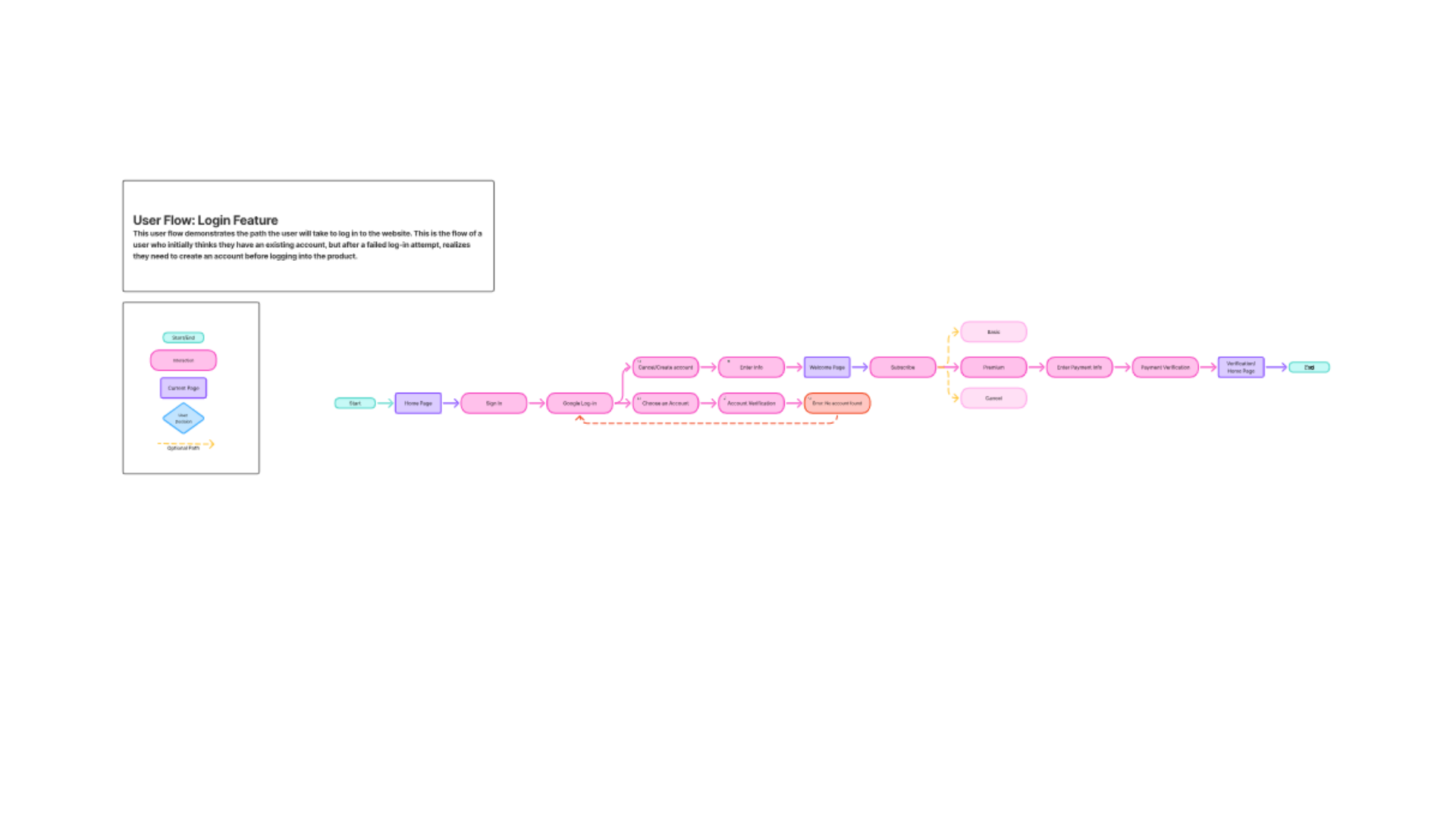
Next, I determined the steps the user would need to take to complete a given task within the website, as well as the user flow involved in navigating the site, to help determine which pages needed to be prioritized and brought into the design process.
Design
Wireframes
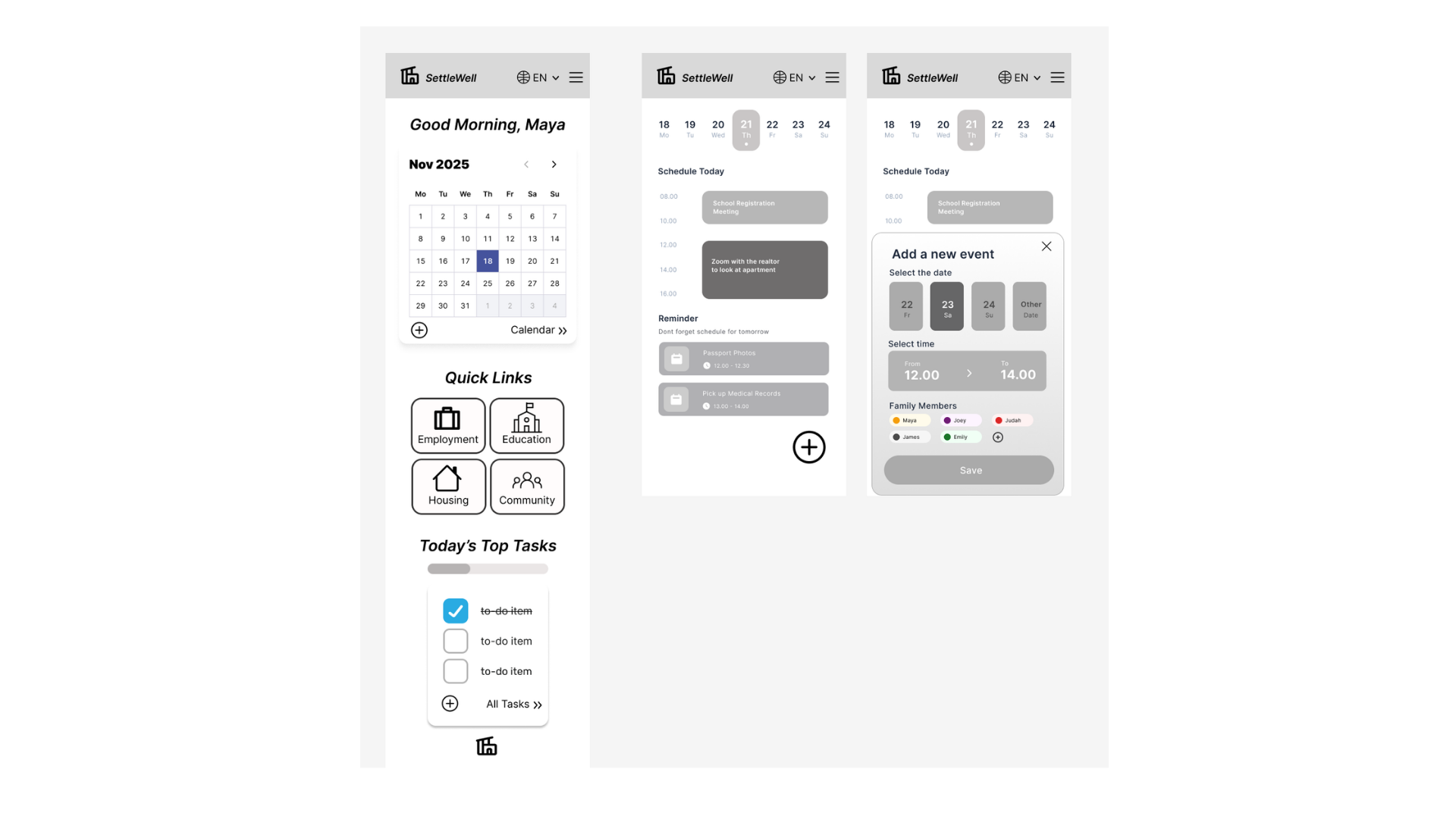
Stepping into the design framework, I created a series of low-fidelity wire frames.
I based my designs on my research into the UI of similar existing products, selecting which elements I thought would be most useful to my product and its users.
My goal was to select elements which were clean and user friendly, while also prioritizing efficiency for the busy parent.
Visual Design
Prototype
As I began to build my digital wireframes, I made sure to prioritize accessibility throughout my design decisions- ensuring buttons were large enough, text was legible, etc.
I also refocused on the main goals of our user persona, ensuring the key information our users were prioritizing was easily accessible and visually present, and that the user goals were being met within the design framework.
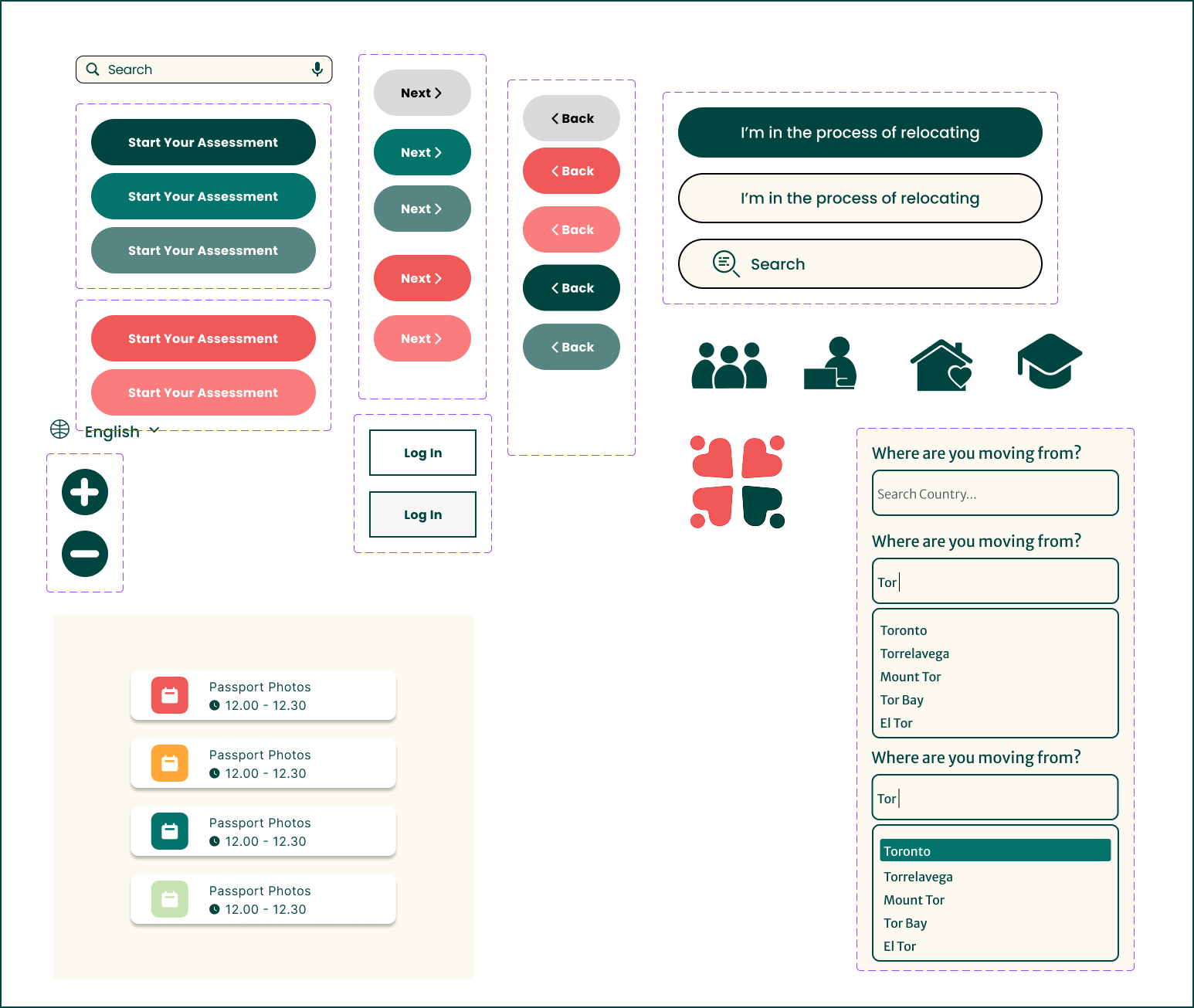
In order to ensure my product visually represented my brand values and told my story, I researched other products to find similarities in their design styles, elements, fonts and colour schemes, prioritizing parenting websites, educational spheres and choosing design elemenets that portray trust.
With my existing goal of prioritizing accessibility for users of different abilities and neurotypes, I also spent time researching colour and design elements and testing my samples to ensure they met accessibility standards.
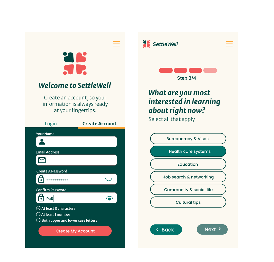
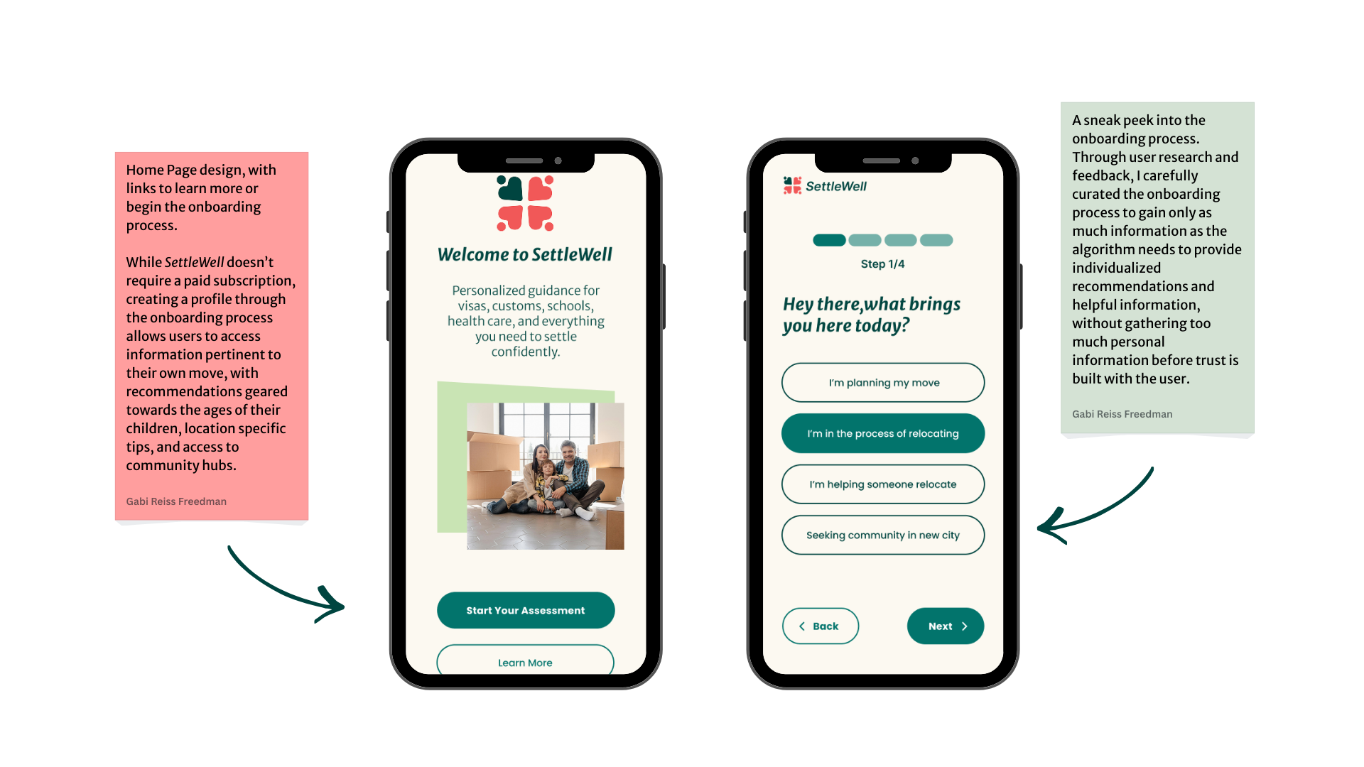
Bringing it all together, I created my high fidelity wireframes, prioritizing clean, clear and accessibly user interfaces. I created a sample onboarding experience, as well as a dashboard and calendar feature, which was then brought into usability testing.
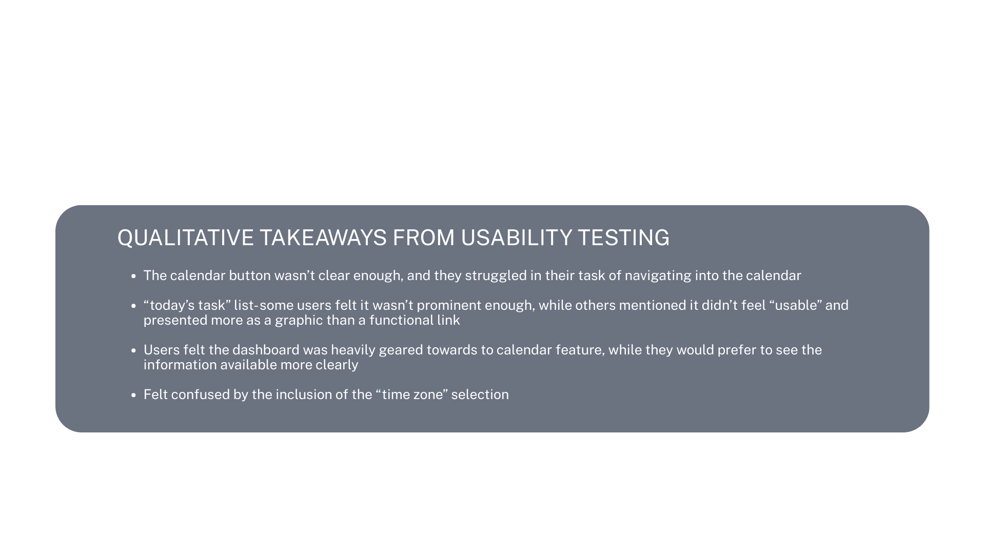
The usability testing helped me to narrow down any existing problems or pain points within the design.
Iterations
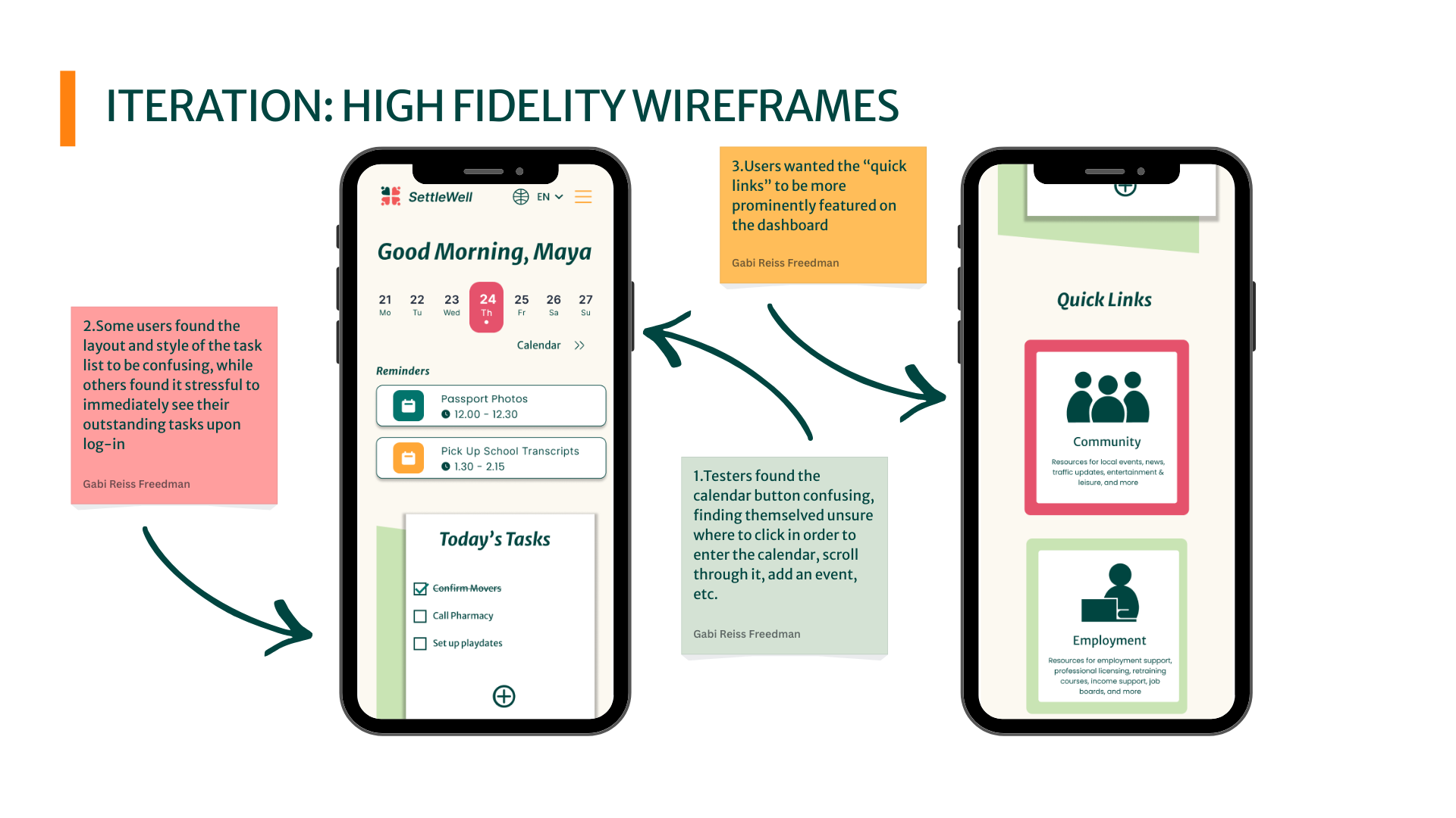
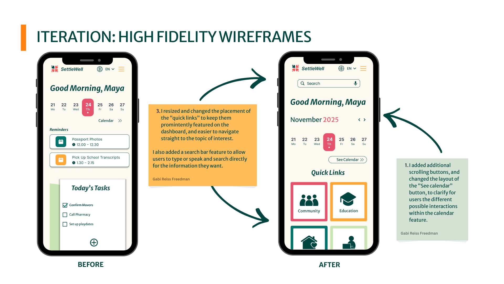
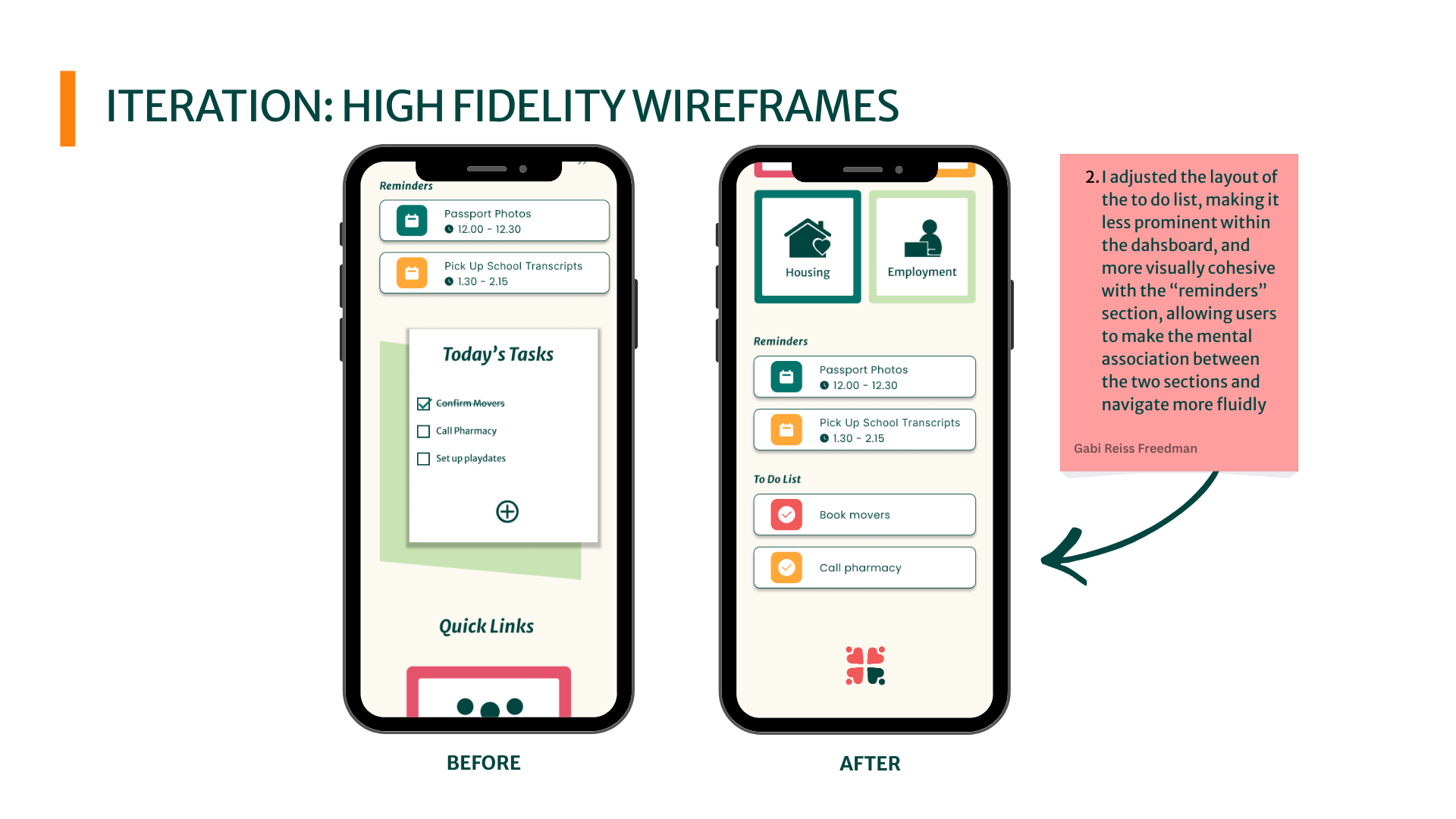
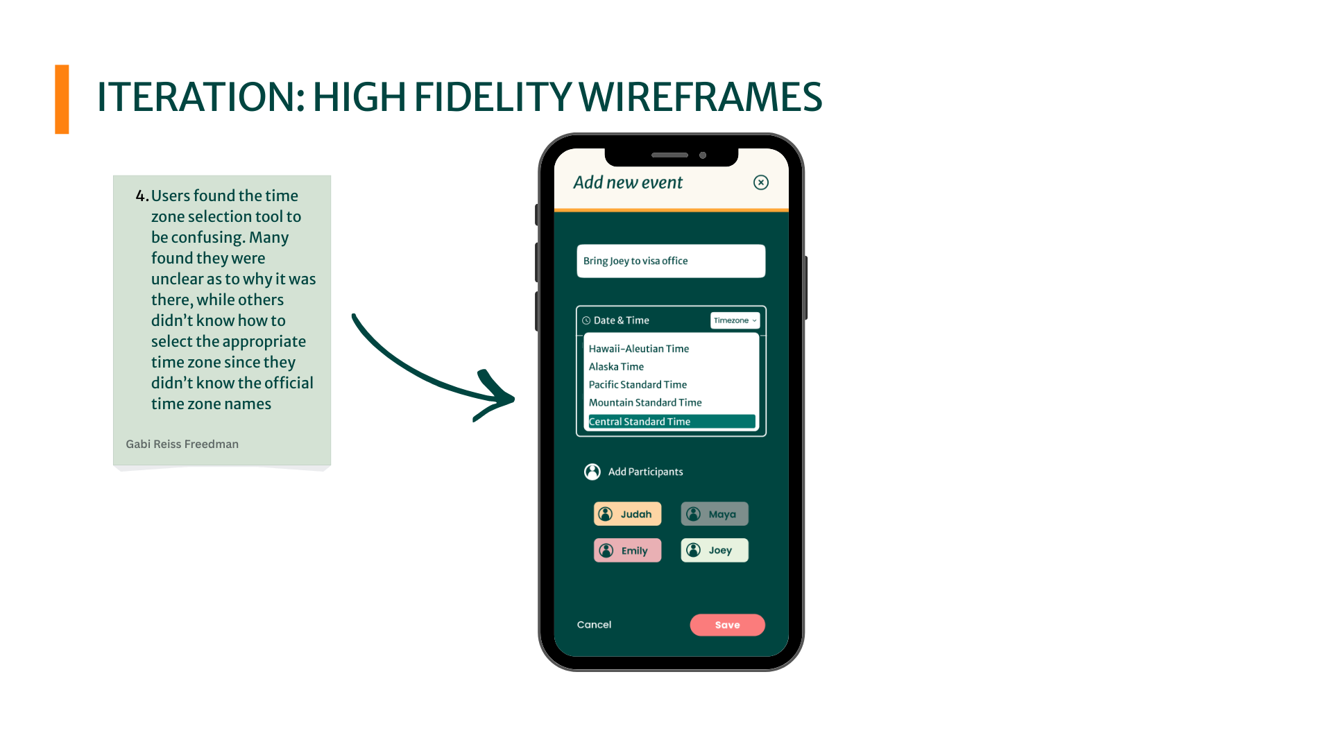
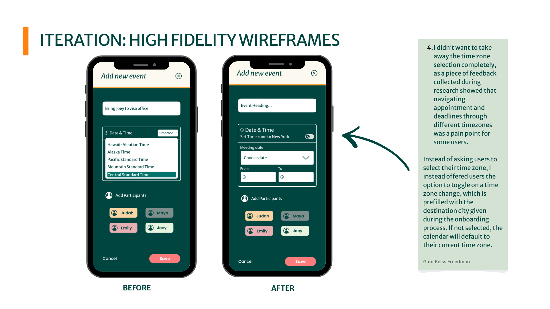
Based on the feedback from user testing, I adjusted the layout of the dashboard, redesigned the buttons for the calendar features, made the information cards more prominent, and reconsidered the application of the “time zone” feature within the calendar tool.
Taking Action
After bringing it all together, and analyzing the results of my user research, I believe this product could fill a need for many parents who are feeling stuck throughout their relocation process, offering both organization and education opportunities.
With more time, I would run longitudinal research with parents at different stages of relocation to validate the design and understand how needs and behaviors change over time.
While the relocation process can feel very overwhelming, with the proper supports available through SettleWell, I believe we can make a positive change for a lot of families.
Results
Contact us
Interested in working together? Fill out some info and we will be in touch shortly. We can’t wait to hear from you!